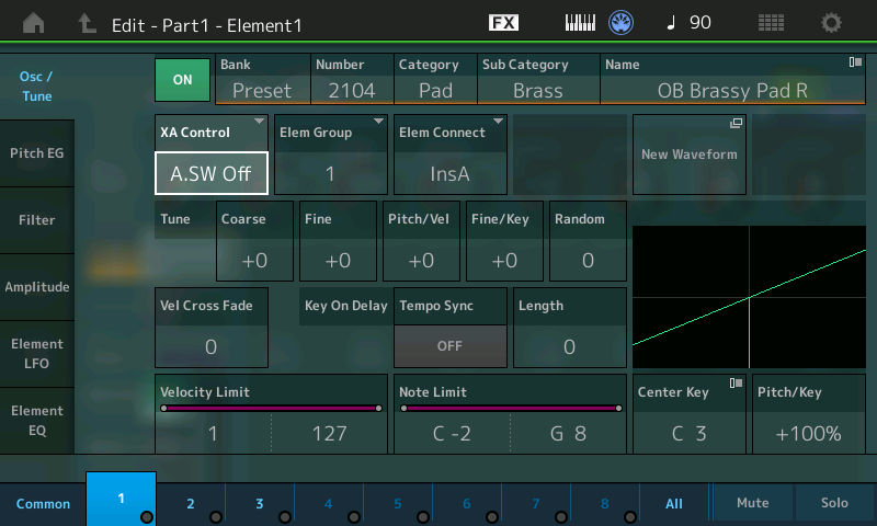
Do these models have 'COPY/EXCHANGE' functionality similar to that in the Modx?
See Page 132 on the Modx Reference doc
https://usa.yamaha.com/files/download/other_assets/2/1192582/modx_en_rm_c0.pdf#G4.1055723
Copying or Exchanging Elements
You can copy or exchange between Elements
Operation [PERFORMANCE (HOME)] [EDIT] Select Element to be copied [SHIFT] + [EDIT]
I haven't found any similar functionality for the M8X.
Nor have I found any way to display more than 1 element on the main display or to display ANY element
numbered higher than 8 on the sub display.
Should be the same shortcut
[SHIFT] + [EDIT/(circle with arrows icon)]
https://manual.yamaha.com/mi/synth/montage_m/en/om02screenparameters0460.html
Current Yamaha Synthesizers: Montage Classic 7, Motif XF6, S90XS, MO6, EX5R
[SHIFT] + [EDIT/(circle with arrows icon)]
Yep - that works if you are in edit for the part.Somehow I overlooked that one.
But the inability to view more than one element at a time is going to be a problem.
As is the inability to easily determine which of the 128 elements are actually being used for a part.
The top of the main display will show the 1st 8 elements and be lit if the element is used in the part.
But that doesn't apply to elements 9-128.
See p 292 - https://usa.yamaha.com/files/download/other_assets/2/2172442/MONTAGE-M_OM_En_v111_A0_web.pdf
It discusses the controller settings and when the destination is an element attribute the display shows
8 elements and has an 'Element SW' drop-down where you can select 1-8, 9-16, etc to select a different of 8 elements.
I haven't found anything similar for the element edit screen.
Look at the graphic at the top of page 307. That is the element edit screen. Notice at the bottom of the image only ONE knob is being used.
Seems like it might be possible to use a second knob to change the element number being displayed. That wouldn't give you any 'side by side' like the 'Element All' I described but it would at least give you much quicker, and easier access to the other elements.
Those screens with the part and element dropdowns at the top could benefit by being able to use knobs at the bottom to make the selections. Right now you have to use the touchscreen to dropdown the menu and then use the touchscreen to do the scrolling and then again use the touchscreen to make a selection.
Right now you need to use that Element dropdown at the top of the screen. That shows ONLY element numbers, 8 at a time. Maybe they could add an * to that menu for elements that are ON and being used. That would at least provide SOME way to know which of the 128 elements actually
have their switch turned on.
1. INIT NORMAL (AWM2)
2. set element extension ON
3. set element number to 128
4. navigate to any element other than 1
5. the element switch is now OFF by default
The old instruments only had 8 elements and had no element switch. You always had 8 but the LEVEL was off by default for 2-8.
Now the elements had an ON/OFF switch that defaults to OFF for elements 2-128.
Which means, IMO, that now you need a quick way to know which elements are ON without using drop downs and going having to actually display each element screen to look at the switch setting.
Againa, IMO, that needs to be addressed as a priority item. It simply isn't practical to examine someone else's work, or even your own, and know which elements are being used.
The last gen had element on/off switches.

Green "ON" box in the upper left.
Before all elements were indexed at the bottom and dimmed elements meant those elements were turned off (4-8 in above image). I don't know if they have similar dimming for elements that are off in the M. That could at least reduce some (not all) menu diving.
Current Yamaha Synthesizers: Montage Classic 7, Motif XF6, S90XS, MO6, EX5R
I don't know if they have similar dimming for elements that are off in the M
No - for 1-8 they show as a line of dots at the top of that graphic I mentioned. For 9-128
you can only see one at a time on it's own screen and that screen has an ON/OFF switch and a
knob under the main didplay that can also be used to turn the element on or off.
Before all elements were indexed at the bottom
That's gone as is that 'all' selection that brought up a screen where you could see some parms for all 8 elements at once.
I'd be surprised if they aren't already working on an update to add the ability to see multiple elements at once. I rather like my idea of adding knobs at the bottom: one to let you select common or a part
to match its dropdown and another knob to let you twiddle to the element you want.
From a software point of view that functionality is totally isolated from affecting any existing functionality so would require a minimum of testing. And given that those knobs are software driven it should be straightforward - turn the knob and bring up the next element/part screen - like the old-style way of changing tv stations.
As soon as they fix my IdeaScale logon issue I'll post some of these things there.
