Also note that the threads don't seem to be displaying in proper order unless I log in.
I hope they have fixed a couple of issues I always had with the old forums:-
Yamaha has opened, and closed, the new forum several times since the old one was shut down. There are still unresolved issues that need to be fixed and a lot of cleanup that hasn't been done.
1. the browser differences I mentioned in an earlier reply still exist. You get a different list of recent threads depending on whether you are logged in or not. If you are not logged in you even get a different 'most recent thread' on the 'Forums' tab (one hour ago) and the 'Recent threads' tab (3 weeks ago).
2. the majority of the listings on the 'members' tab show no posts or activity at all even when the join date is several years old. Select the tab and then choose almost any page down several hundred and the entire list of members are like that.
There are some listings that are either SPAM or used for testing. From the members tab search for this member:
'Get Body Masaza To Have Utmost Comfort And Relaxation ' - yes, you read that right. That is the actual member name listed. You will find a lot of others with similar text for the name.
3. the number of members doesn't match - on the main forum page, 'forum information' at the bottom, it shows 35 K Members, but on the Members tab is only shows 2299 pages and only 15 members are listed on each page. Those numbers don't match.
Maybe they haven't migrated all of the users yet or maybe a user has to log in in order for their activity to be migrated.
At least you can now search for old threads. I suggest you find, copy and save anything you are interested in, old or new, in case it disappears if, and when, these things get fixed.
It is great to see progress with these new forums engine. It's great to be able to post once again, and also to be able to read others new posts. I use mostly Chrome and sometimes Edge.
I think my experience so far has been much the same as those who also use those browsers.
My preference would be to view "Recent Posts" publicly as the default filter/sort view when not logged on. I don't always want to be logged onto the forum when viewing & checking out new posts/threads, but as it currently stands I first need to login, even if just for a quick peak at what's new/recent within this 'Montage Series Synthesizers' forum. Hopefully the current default public filter/sort gets sorted out and will be set to "Recent Posts" eventually (within each of the various Forums). Perhaps Firefox still has a different experience as Andrew has pointed out..!?
The "Recent Posts" link at the top of each Forum points to https://yamahasynth.com/community/recent/ ; However that takes you out of the forum you are currently in, and sorts for all the various Forums combined; which is not ideal for many who just want to check out recent posts in a specific forum, such as the 'MONTAGE Series Synthesizers' forum, or another specific forum...
Looks like the forum is down again. The banner currently link resolves to:
https://yamahasynth.com/forum-interruption/
The latest announce still says the forum is open:
https://yamahasynth.com/learn/news/forum-update/
... I'm guessing the interruption is planned on being short.
Current Yamaha Synthesizers: Montage Classic 7, Motif XF6, S90XS, MO6, EX5R
1. Forum is now allowing logins and replies
2. Recent threads list displays properly in Firefox
3. Recent threads list displays correct list without being logged in
4. 'Under Construction' messages are now gone and the broken link to them removed.
At this point, maybe we should just be grateful that the site has any functionality whatsoever, but to the extent that people are still working on finessing the experience... geez, the new layout is irritating! So much space wasted (huge logo, tons of white space, showing lines of individual entries under topics)... I've attached a screen shot of this forum and gearspace side by side on my large monitor... I can immediately see 10 topics on GS, and only 2 topics here, even in these big windows, and even with GS dedicating a big chunk of space to advertising. So much unnecessary scrolling here!
I don't see a huge difference in general usability for me between the previous yamahasynth forum and current one. There are a few things that are better. A few that took a step back. I think it still provides a reasonable vehicle for getting help, trading ideas, keeping up with the news. Hoping we can reach critical mass of helpful/interesting discourse vs. the various infomercials that have been popping up.
While comparing sites - how about a "sister" site which is somewhere in the middle (smaller than current banner, compressed topic-to-topic but not as dense as gearnews).

Current Yamaha Synthesizers: Montage Classic 7, Motif XF6, S90XS, MO6, EX5R
That looks much better. Too bad Yamaha didn't choose to have this site done by the folks who do the Steinberg site. (Though I doubt the column with the little circles is worth the bother.)
3. Recent threads list displays correct list without being logged in
Oddly, this was working for me yesterday via both Chrome and Edge browsers while not logged on, but today while not logged on, the "Keybaord + REAPER DAW" thread is at the top and the "New Moessieurs video: using the Subscreen to edit an AN-X part!" thread is no where to be seen...
Just to add a small item that I noticed could be improved on the new site.
There are some great Facebook groups that I am a member of and follow. It would be great if Yamaha's site developers could add the Facebook/Meta icon link at the bottom of these pages to the right of "Share: " (that contains the 3 dot symbol to its left)...!! 
While comparing sites - how about a "sister" site which is somewhere in the middle (smaller than current banner, compressed topic-to-topic but not as dense as gearnews).
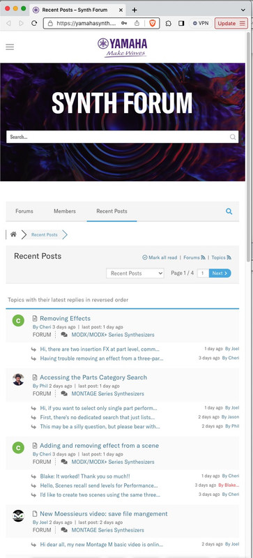
I've discovered that part of the issue is the screen-size scaling. The new site seems optimized for narrow window width (presumably mobile) use, at the expense of large screen desktop. If I make the window on my large screen suitably narrow, I see this:

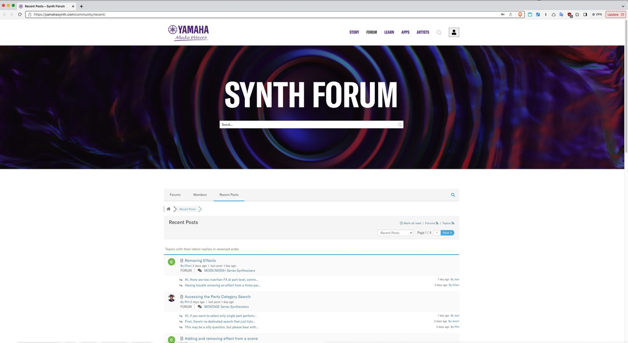
but I have a large screen on my desktop so I can see more content, and instead, on this site, as I make the window wider, I see less, with this result for that same page when I enlarge the window to the the full size of my screen as I typically would:

In the old days, we saw many desktop-based designs with poor usability on mobile, but here we seem to have something like the same problem in reverse... something designed primarily for mobile, with not only no better, but actually worse usability on large screens. I think the most obvious (and perhaps easy to fix?) issue is that the banner should not be growing in height as the window is made wider.
This is an important feature that is missing.
You cannot change your e-mail address in the account settings.
An old problem, that I think was eventually fixed in the previous forum software, seems to be back. If you quote a post, type a reply, then quote an additional post as part of the same thought, quoting that second post will wipe out all previous content of your new post (your previous quoted message, and any reply you had already composed).
quoting that second post will wipe out all previous content of your new post
That has happened to me when I inadvertently had my reply text selected and then hit a key. And typing a reply seems to have a time limit - sometimes hitting 'reply' fails and my entire reply is gone.
I've basically started selecting my entire reply and copying it to the clipboard just so I can get it back if something goes wrong.
After you login you're in a race against the system kicking you out. So before adding replies or saving messages it's best to copy the message in case it throws everything you just wrote away (after logging you out due to timeout). In general, the timeouts are very aggressive forcing frequent re-logins. And also since you can't see a reasonable list of new messages unless you login - there's not a way to casually read what's new throughout the day without logging in a bunch of times (depending on your usage).
Also the "edit" message feature only gives you a few minutes to go back and make corrections. So it's best to assume that there's no edit capabilities.
I'm hoping somehow there's benefits in terms of filtering out spam. So it's just a "deal-with-it" sort of thing for me personally.
Current Yamaha Synthesizers: Montage Classic 7, Motif XF6, S90XS, MO6, EX5R
